Definition
Eagle was born as a personal brand destined to help other businesses in areas such as management and investments.

Symmetry vs. Harmony
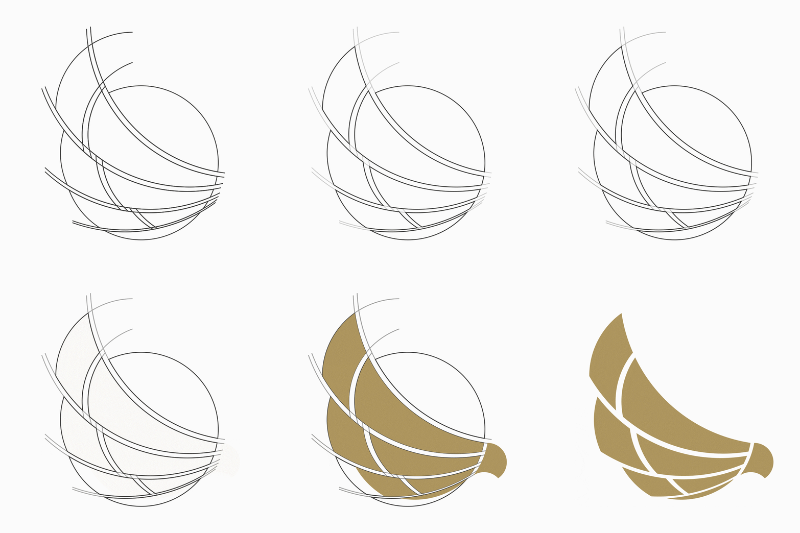
The construction of the logo, aside from the indications that contribute to the name, held the condition given by the client to be symmetric, as symmetry fascinated him.
In the end, the client understood a harmonic proposal that, while not symmetric, served as a way to transmit all that the brand stood for and what he most desired.


Elegant and without pause
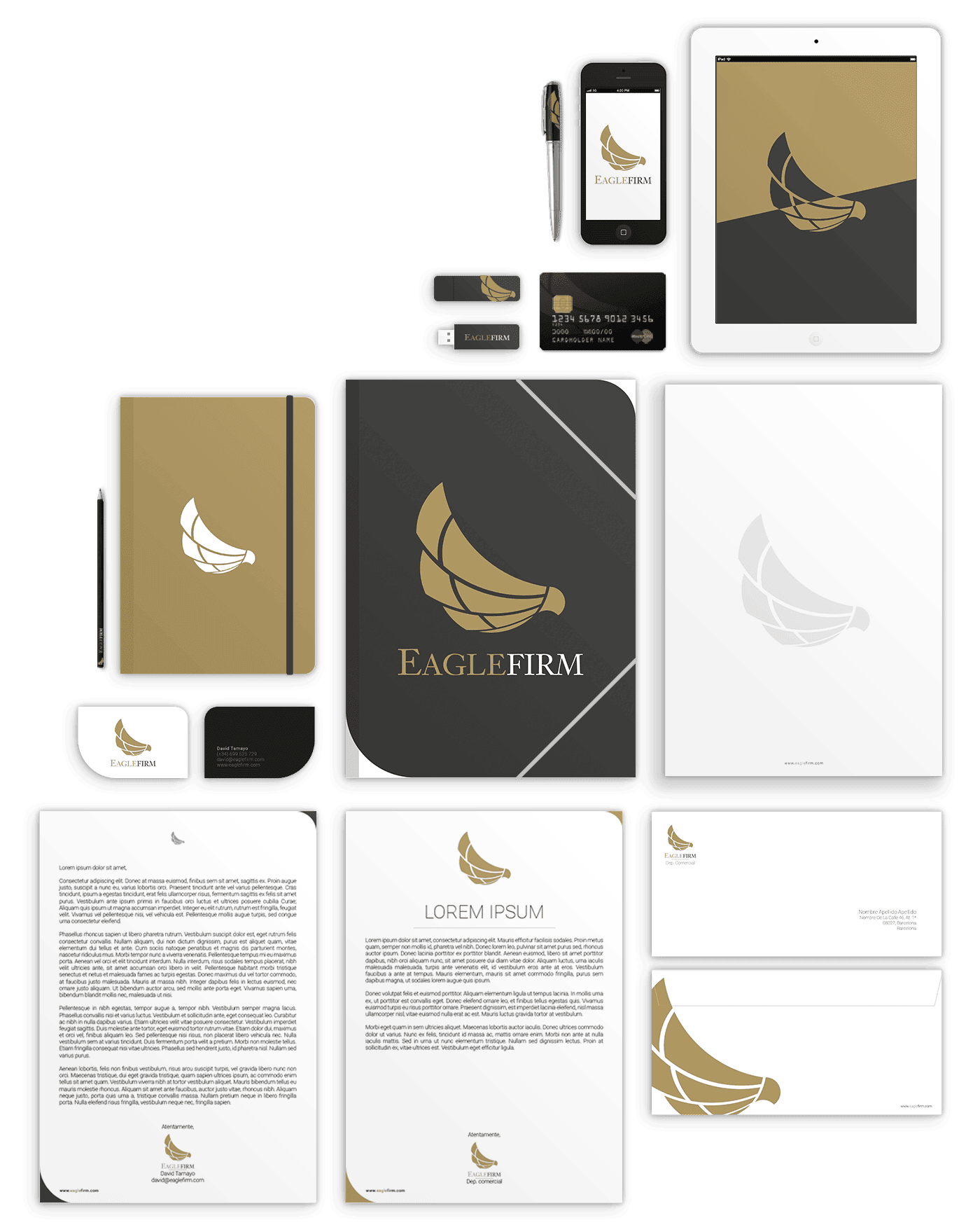
The final result is simply elegant, with its own style, and despite the sober colors and typography, transmits dynamism, a constant forward flow, like an eagle that doesn’t pause, focused on their destination.

Three areas, one project
In his project, the client wanted to take on various branches: Eagle Firm, Eagle Group Investment, and Eagle Club, but maintain one sole brand identity.


